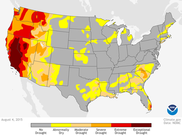
 This image depicts the droughts existing in August 2015 and their severity indicated by the colors, yellow to red in accordance with rising severity. The graph indicates that droughts were most severe on the West coast, particularly in California. Something we experienced and already knew, however, it is interesting to me that states to the north of us were suffering similarly. 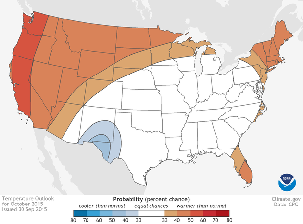 This graph uses a color scale to illustrate the temperatures across the United states in October 2015, done in comparison to average temperatures. October is when temperatures here should be cooling down, however the dark red coloring of most of California shows that we experienced higher temperatures than normal. Combined with the drought, this is a serious issue.
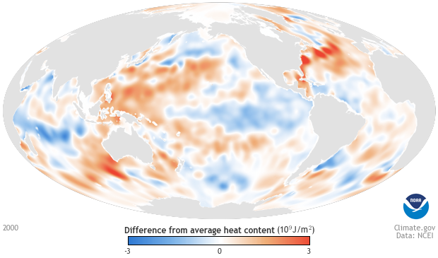
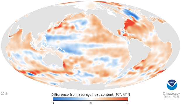
The image to the left is from the year 200 and the one to the right is of the year 2016. Comparing the two, it is obvious that the average heat content has increased as the 2016 image contains more red and less blue. This can be attributed climate change and global warming. 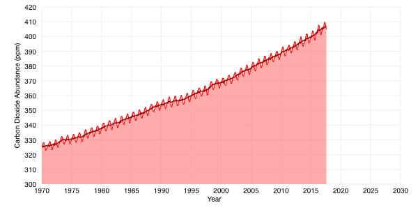 Here can be seen the change in carbon dioxide abundance between 1970 and today. The trend is obviously increasing, most because of emission caused both by humans and natural sources. However, the increasing is most likely more drastic because of urbanization and other human emission. 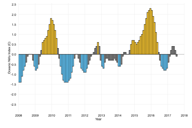 Depicted here is the patterns of El Nino and La Nina over the span of a decade. When the index is greater than 0.5, El Nino conditions are considered to be present. Meanwhile, an index of less than -0.5 indicates conditions of La Nina. It is interesting that the occurrences of El Nino are fewer but greater.
0 Comments
Leave a Reply. |
Archives
October 2017
Categories |
 RSS Feed
